The thing about exhibition stalls is that people make up their minds to stop or walk away in a matter of seconds. Not minutes. Seconds. Your exhibition stall decoration is not just about aesthetics; it’s working overtime to draw, retain, and direct attention.
If you are organizing an exhibition, your stall design can be the unseen make-or-break factor in the entire process. Here are some effective ways to decorate your stall that work on the exhibition floor.
Before you consider colours, lights, or props, get one thing straight. What is the one idea you want visitors to understand the moment they see your stall?
Too many stalls attempt to communicate too much. Products, services, values, slogans, and awards. The effect is visual clutter. Effective stall decoration is singular. One message. One feeling. One takeaway.
If your brand is about innovation, reflect that in clean lines, modern materials, and interactivity. If it’s about trust or heritage, warm colours, structured grids, and subtle textures are more effective. The stall should not feel cluttered but considered.
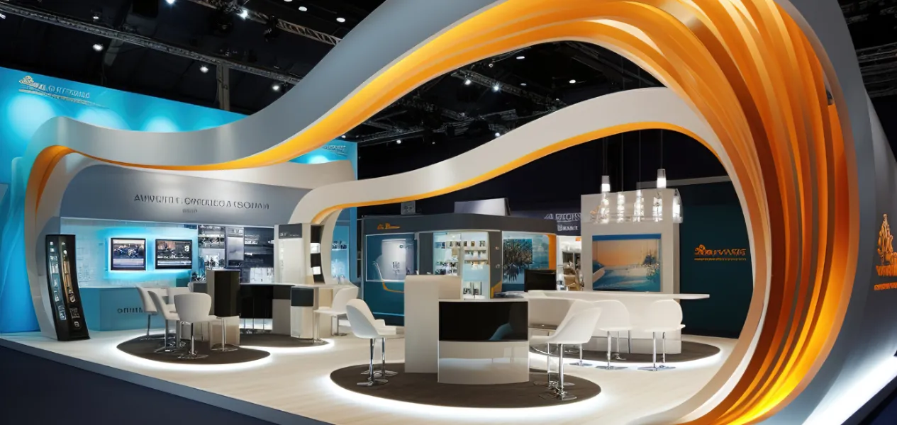
Exhibition halls are flat by design. Height is your advantage. Vertical features such as overhead frames, banners, lighted arches, or high back walls will help your booth stand out from the crowd. Even vertical branding panels can make a big difference in visibility.
It’s not about creating something huge. It’s about intelligent structure. A well-located elevated logo or feature can draw people into your environment without needing to say a word.
Lighting is usually an afterthought, and that is just not right.
Good lighting will illuminate more than just your stall. It will create ambiance, draw attention, and add dimension. Spotlights can be used to feature important items or displays. Warm lighting can be used to create welcoming areas. Accent lighting can be used to direct attention to branding or graphics.
Don’t have harsh white lighting throughout. Vary it. Lighting can direct the movement of visitors and what they notice first.
A common error is to create obstacles without even realizing it. Counters placed too close to the aisle, cluttered merchandising, and narrow entrance points can unconsciously deter customers.
Imagine your stall as a small room without walls. Leave room for people to step into comfortably. The entry points are important. So is the flow.
If your guests are uncomfortable with where to stand or walk, they will be out of there in a hurry. Open floor plans convey confidence and make it easier to strike up a conversation.
Bigger visuals are very effective, but only if they are clear. Do not use paragraphs that are too long or text that is too small. Chances are, no one will bother to read it. Use effective visuals, short messages, and headlines that can be read from afar.
Your graphics should be able to answer basic questions quickly. What do you do? Who is it for? Why should someone care? If your graphics require explanation, they are doing too much.
Engagement doesn’t have to be high-tech. Touch screens, product launches, sample areas, or even simple product displays will encourage people to linger. Even small elements of engagement will make your stall more memorable.
The trick is to be relevant. Do not add interactivity just for the sake of being cool. Ensure that it relates to what you do and that it assists visitors in comprehending it.
Flat panels all around can make a stall seem dull. Varying materials can bring personality.
Wood, fabric, metal, acrylic, and even plants can change the ambiance of a place. The addition of texture makes stalls look high-end and well-designed.
You don’t need fancy materials. You need contrast. Smooth and rough. Matte and glossy. Light and dark. These things are processed subconsciously and raise the whole experience.
Branding is not about logos all over the place. It is better to have one strong logo placement than to have ten poor logo placements. Similar colours, fonts, and visual elements are more effective in terms of recall than repetition.
Your booth should feel like an extension of your brand, not just a banner stand. When branding is effortless, trust is built.
Decoration is not only aesthetic. It is functional. If meetings are a part of your exhibition strategy, seating arrangements should be made. If demos are time-consuming, standing areas should be provided. If lead generation is an objective, counters should be positioned conveniently.
A beautiful stall that is not very comfortable to use will not function well. Functionality and beauty must complement each other, not compete with each other.
These final checks help ensure your stall looks intentional, inviting, and ready for real conversations the moment the doors open.
Small but thoughtful details can create the biggest impact. The feel of your space, the cleanliness of your cable management, the flirtation of your staff with the customers, the consistency in uniforms, the use of subtle scents, and even the playing of background music can literally dictate your visitors’ moods. All these do not shout. They whisper professionalism.
The creation of a great stall is not about the latest design trends; it is about clarity, intention, and experience. When every design choice supports a clear message and facilitates a comfortable interaction, your stall stops being just another booth and starts becoming a destination.
This is the very point where experienced partners in exhibitions come in and make a difference. Teams such as Fusioncorp are well aware of how the design, branding, and visitor psychology interrelate in the exhibition, thus helping the brands to make the physical spaces meaningful for their engagement through professional exhibition stand design and execution.
If you are going to participate in your next exhibition, then it’s better to invest in the stall decoration that not only attracts eyes but also earns attention. You can explore our work or contact the team to plan a stall that truly performs.
A visually attractive exhibition stall has a clear message, balanced use of lighting, open layout, and consistent branding that can be understood within seconds.
Stall decoration plays a crucial role in visitor engagement by drawing attention, encouraging entry, and supporting comfortable interactions on the exhibition floor.
Yes, small stalls can be highly effective when decorated with clear messaging, smart lighting, vertical elements, and clutter-free layouts.
The best colours depend on brand identity, but high-contrast palettes and brand-consistent colours usually perform better in busy exhibition halls.
Lighting affects visibility by creating focus, depth, and mood, often influencing visitor perception before they notice graphics or products.
Effective stall decoration balances both, using branding to attract visitors and interactive elements to keep them engaged.
Open layouts, comfortable lighting, engaging displays, and thoughtful material choices help visitors feel welcome and stay longer.
Common mistakes include overcrowding graphics, blocking entry points, inconsistent branding, harsh lighting, and ignoring visitor flow.
Stall decoration planning should start well before the exhibition to allow time for concept development, testing, and on-site adjustments.
Yes, professional designers understand visitor psychology, space planning, and execution details that help stalls attract attention and perform better.
Also Read: The Psychology of Booth Design: Attracting Visitors
Also Read: How to Choose the Right Exhibition Stand Type
Also Read: How 3D Design is Revolutionizing Exhibition Stands
Also Read: How to Design an Eye-Catching Exhibition Booth
Also Read: The Rise of Interactive AV (Audio-Visual) in Exhibitions
Also Read: Virtual vs. Physical Exhibitions: What Works Best?
Also Read: How AI is Transforming Event Engagement
Also Read: Mistakes to Avoid in Exhibition Planning