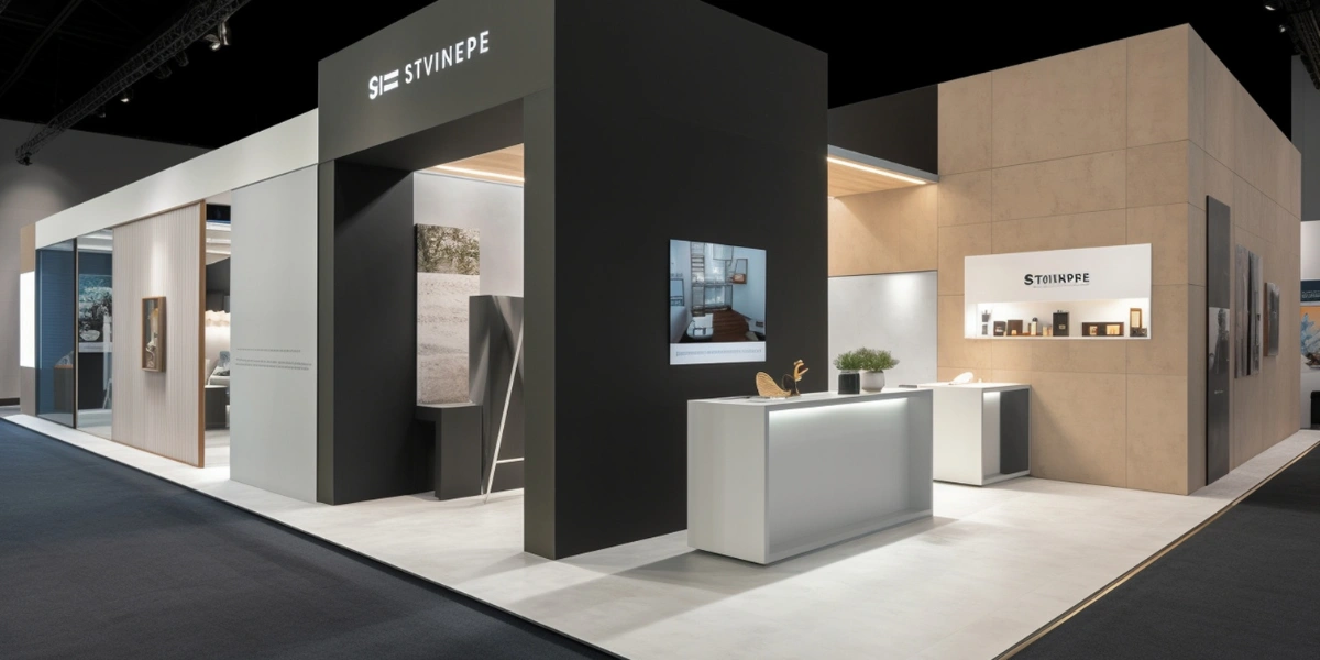
The best stalls begin at the onset of stall design, not when the designer has begun to draw the layout. Your logo, photos, colour scheme, messaging and video content – they all communicate the message that people see when they see your brand. This may lead to low visual performance, incorrect colour representation, and delays. How can you prevent these issues? Designers work faster when there is a well-defined system in place. This ensures a uniform appearance for the finished product.
Take a few seconds and determine what your visitors need to know. The question is: do you have a product to launch, multiple products to display or product awareness to build? For instance, a machinery business could wish tourists to check out one piece of equipment first. Thus, it is important that this product receives a stronger visual space.
In the first step, put all your brand elements in one folder before starting the booth design. This will make your designer's job much simpler as well as keep the whole exhibition stand coherent due to the use of similar elements and styles. Start with the most recent logo file. In addition to that, you need to collect your guidelines, product pictures, brochures, icons used, fonts, videos, slogans, etc.
If your brand is based on certain colours, make sure you also provide the correct colour codes. This is important; otherwise, the designer cannot create the stall according to the corporate identity. Do not forget to put the old versions of your logos, brochures, and photos in a separate folder. If you use an old file by mistake, the results could be expensive. At the end, give your files appropriate names like "CompanyLogo_Final", "ProductA_HighResolution", etc. It can save you time and prevent misunderstandings during the whole process of designing and printing.
A logo may look sharp on a laptop but become blurry on a large wall. Provide high-quality files whenever possible. Vector formats such as AI, EPS, or SVG usually work well for large graphics. Also, share light and dark logo versions if available. Never stretch a logo to fill space. Distortion can make a professional brand look careless.
Choose sharp, well-lit photographs. Avoid tiny images taken from websites or messaging apps. Visitors should understand the product without standing very close. For example, a product image with a busy background can disappear among other stall graphics. A clean image can make the product easier to notice.
People don't tend to read long blocks of text on a stall wall. Make concise headlines with benefit explanations. For instance, instead of saying "Advanced solutions designed to improve operational efficiency," you could say "Reduce Production Time." The second message is more easily understood. Develop 3-4 key messages before design, but during the design phase. After, rank them in order of importance.
Not every brand asset will be effective in all areas of an exhibition stall. If the logo is visible clearly on a large back wall, it might not be as visible on a smaller counter. Likewise, a product image can be flattering when displayed on a rectangular wall but not on the arc of a curved panel.
Thus, specify on the designer's map where each asset should be placed. If it is possible, informally share the stall layout and size. Talk about hanging signs, counters, pillars, product displays, curved panels and floor graphics. Also consider how far away people can see and how visitors use the site. This makes important visuals more noticeable to the viewer and helps the designer locate them.
There are differences between preparing digital monitors and printed images. You should consider the video characteristics, including size, format, and quality. The text appears clear with large letters that are easy to read from afar. Additionally, make sure that significant data appear. It is advisable to carry out tests on the videos beforehand to resolve any technical issues well in advance.
Also, don’t forget to find out whether the monitor will have sound or whether subtitles will be needed. It is also important to keep the video short because visitors can only spend a few seconds watching it. The visitors must not be distracted from the main messages; thus, there shouldn’t be too much information on the screen. Movement of objects should be simple, and visuals should be easy to understand.
Finally, check all assets before approving production. Identify spelling errors, out-of-date contact information, wrong product names and colour variations. Let's assume the following simple case. After printing their stall graphics, a company finds an old telephone number. If it's not corrected, money and time will be wasted. By ensuring that everything is in order in advance, you can avoid such errors.
Preparing brand assets may seem small, but it affects the overall design process for the exhibition stall. Start early, keep all files organised, and review everything carefully.
FusionCorp follows these principles while preparing professional exhibition stall design projects. With a structured approach to branding, visuals, and fabrication planning, brands can focus on creating a clear and memorable visitor experience.
You can also explore FusionCorp’s completed exhibition projects to understand how strategic brand presentation transforms exhibition spaces.
Brand assets such as logos, images, colours, fonts, and messaging help create a consistent visual identity. Properly prepared assets allow designers to create an exhibition stall that represents the brand effectively.
Businesses should provide logos, brand guidelines, product images, brochures, fonts, icons, videos, slogans, colour codes, and other important marketing materials required for stall design.
High-quality vector formats such as AI, EPS, and SVG are preferred for exhibition graphics because they can be scaled to large sizes without losing quality or becoming blurry.
High-resolution product images maintain clarity when displayed on large booth walls, counters, and digital screens. Clear visuals help visitors understand products easily from a distance.
Exhibition messages should be short, clear, and focused on key benefits. Simple headlines help visitors quickly understand the brand’s offerings without reading lengthy content.
No, different booth areas such as walls, counters, displays, and panels require different approaches. Assets should be adapted according to size, visibility, and visitor movement.
Digital assets should have proper resolution, suitable formats, readable text sizes, short videos, and simple visuals that can be easily understood by visitors within a few seconds.
A well-organized brand asset folder saves time, prevents confusion, and helps designers use the correct files during the design and fabrication process.
Before printing, businesses should review spelling, contact details, product names, images, colours, and other design elements to avoid costly corrections after production.
Fusion Corporate Solution helps businesses prepare and integrate brand assets into professional exhibition stall designs, ensuring consistent branding, effective visuals, and a memorable visitor experience.
Also Read: The Psychology of Booth Design: Attracting Visitors
Also Read: How to Choose the Right Exhibition Stand Type
Also Read: How 3D Design is Revolutionizing Exhibition Stands
Also Read: How to Design an Eye-Catching Exhibition Booth
Also Read: The Rise of Interactive AV (Audio-Visual) in Exhibitions
Also Read: Virtual vs. Physical Exhibitions: What Works Best?
Also Read: How AI is Transforming Event Engagement
Also Read: Mistakes to Avoid in Exhibition Planning