Most exhibition stands don’t fail because they look bad. They fail because they’re designed in isolation. A designer makes it look good. A marketing team approves the messaging. Operations worry about logistics. Nobody steps back and asks whether the stand will actually work once people start moving through it.
That gap shows up fast. Empty corners. Awkward entry points. Visitors who stop, glance, and walk away. This is where a real exhibition stand design checklist matters, not as a list of boxes to tick, but as a way to pressure-test decisions before they cost you visibility.
Design should never be the first conversation. The intent should be. Every exhibition has a different purpose. Some are about visibility. Others are about product demos, lead capture, or private discussions. When intent isn’t defined, design becomes decorative instead of functional.
Before any design work begins, alignment needs to exist internally. The stand should support one primary goal, not multiple competing ones. Once that goal is clear, every design choice becomes easier to justify or reject.
Visitors don’t study exhibition stands. They scan them. If your core message isn’t immediately obvious, foot traffic keeps moving. The most effective stands communicate one strong idea clearly and let conversations fill in the details later.
This isn’t about oversimplifying. It’s about respecting how people behave in busy exhibition halls.
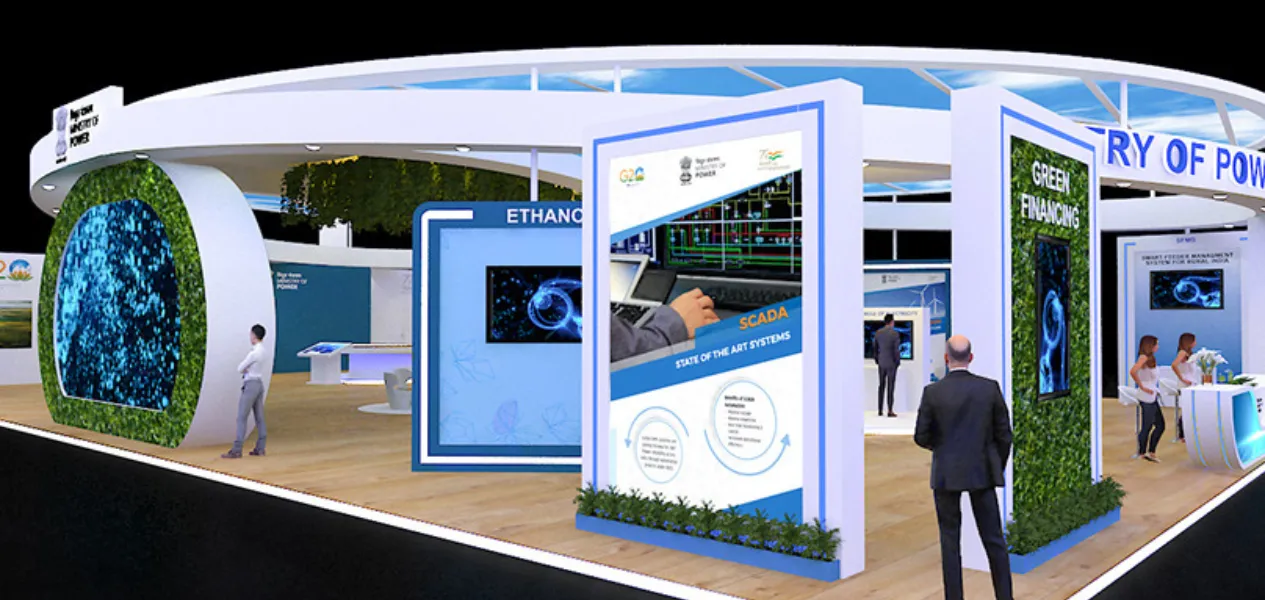
On paper, most layouts look fine. In reality, people behave emotionally, not logically. Visitors hesitate when the entry feels blocked. They leave when they feel watched. They avoid spaces that feel tight or overly controlled. Layout decisions subtly convey to people whether they’re welcome or tolerated.
Good layouts feel open without being empty. They guide movement without forcing it. They allow staff to engage without standing guard at the edge like security.
When layout works, conversations start naturally. When it doesn’t, no amount of branding saves it.
One of the fastest ways to lose attention is to make everything important. When logos, headlines, visuals, and products all compete at the same level, the brain switches off. Visitors don’t consciously analyse this. They just keep walking. Hierarchy creates relief. It tells people where to look first and what can wait. The strongest stands almost feel calm compared to their surroundings, even when they’re visually bold.
Exhibition stands often become branding experiments. New colours. New fonts. New visual language. That usually hurts more than it helps.
A stand should feel like it belongs to the same brand people see online, in presentations, and in offices. When branding feels consistent, visitors trust it faster. When it feels unfamiliar, they question it, even if they can’t explain why. Recognition is built through repetition over time, not reinvention at every event.
Exhibition graphics are often overloaded with information that belongs in brochures or presentations.
In reality, graphics should support conversations, not attempt to complete them. They should spark interest, not explain everything. Strong graphic execution usually means:
If visitors stop reading instead of engaging, the design has overstepped its role.
Lighting decisions are often rushed or delegated late. That’s a mistake. Lighting influences mood, focus, and perceived quality. Poor lighting flattens everything. Good lighting adds depth and intention without drawing attention to itself.
It’s not about brightness. It’s about contrast and control. What’s highlighted? What recedes. What feels warm versus clinical. Many stands look fine in renders and disappointing on-site because lighting wasn’t treated as part of the design from the start.
Materials communicate credibility faster than words. Rough finishes, misaligned panels, or inconsistent textures send a message of carelessness, even if the brand is strong. On the other hand, clean finishes and thoughtful material choices elevate perception instantly.
Visitors may not articulate it, but they feel the difference.
Interactive elements fail when they demand effort before interest exists. The best engagement points invite curiosity without pressure. A demo that can be understood at a glance. A display that encourages questions instead of explanations. Something that gives visitors a reason to pause without feeling obliged to commit. Forced interaction makes people defensive. Natural engagement makes them stay.
This is where many good designs fall apart. Cables show. Bags pile up. Storage overflows. Staff cluster awkwardly. None of this appears in design decks, but all of it affects perception.
A stand that looks polished at 10 a.m. and chaotic by noon hasn’t been designed fully. Operational planning is part of design, whether it’s acknowledged or not.
Walking the stand before opening is not a formality. It’s a test. Stand where visitors will stand. Enter from different angles. Watch how staff naturally position themselves. These small observations reveal problems that drawings never show.
Fixing them early is the difference between a stand that works and one that merely exists.
An exhibition stand is a temporary structure, but the impression it creates isn’t temporary at all. Visitors remember how easy it was to approach, how comfortable it felt to stay, and whether conversations flowed naturally.
That’s why experienced teams like Fusioncorp approach exhibition environments with a deeper understanding of behavior, flow, and intent, rather than treating them as standalone visual displays.
When brands invest in thoughtful planning, proven execution, and learnings drawn from real exhibition stand projects, design decisions become grounded in what actually works on the show floor.
For businesses looking to translate strategy into space, partnering with an experienced exhibition stand design company ensures that every element of the stand supports visibility, engagement, and long-term brand perception.
The most common mistake is designing the stand in isolation without aligning design, marketing, and on-ground operations around a single clear objective.
Exhibition stand planning should begin several months before the event to allow proper intent alignment, layout testing, and operational planning.
An effective exhibition stand encourages natural visitor flow, longer dwell time, comfortable conversations, and supports the primary exhibition goal.
Yes, simple designs often perform better by reducing visual overload and making the core brand message easier to understand quickly.
Layout directly affects how visitors enter, move, and engage within a stand, influencing comfort, interaction, and conversation flow.
Design elements such as openness, lighting, and material choice influence how long visitors stay and how approachable the stand feels.
Many stands fail because operational details like storage, cables, lighting control, and staff movement were not considered during design.
Yes, consistent branding helps visitors recognize and trust the brand faster, while inconsistent visuals can create confusion.
Lighting shapes mood, focus, and perceived quality, often influencing visitor impressions before any messaging is read.
Final checks help identify flow issues, awkward staff positioning, and visual distractions that drawings and renders often miss.
Also Read: The Psychology of Booth Design: Attracting Visitors
Also Read: How to Choose the Right Exhibition Stand Type
Also Read: How 3D Design is Revolutionizing Exhibition Stands
Also Read: How to Design an Eye-Catching Exhibition Booth
Also Read: The Rise of Interactive AV (Audio-Visual) in Exhibitions
Also Read: Virtual vs. Physical Exhibitions: What Works Best?
Also Read: How AI is Transforming Event Engagement
Also Read: Mistakes to Avoid in Exhibition Planning